

The solution
The Challenge: User Engagement & Conversion
Go Eats was facing issues with user retention and conversion. The app had a high drop-off rate during the order process, and users struggled with the complex navigation and unclear tracking features. The challenge was to make the app more intuitive, simplify the order flow, and encourage users to complete their purchases.

Research
Understanding the problem
I took a user-centered design approach, conducting research to identify the pain points and testing with real users to ensure that the final product was both usable and enjoyable.
Key Focus Areas:
User Research & Persona Creation: Understanding the target audience (busy professionals, families, foodies)
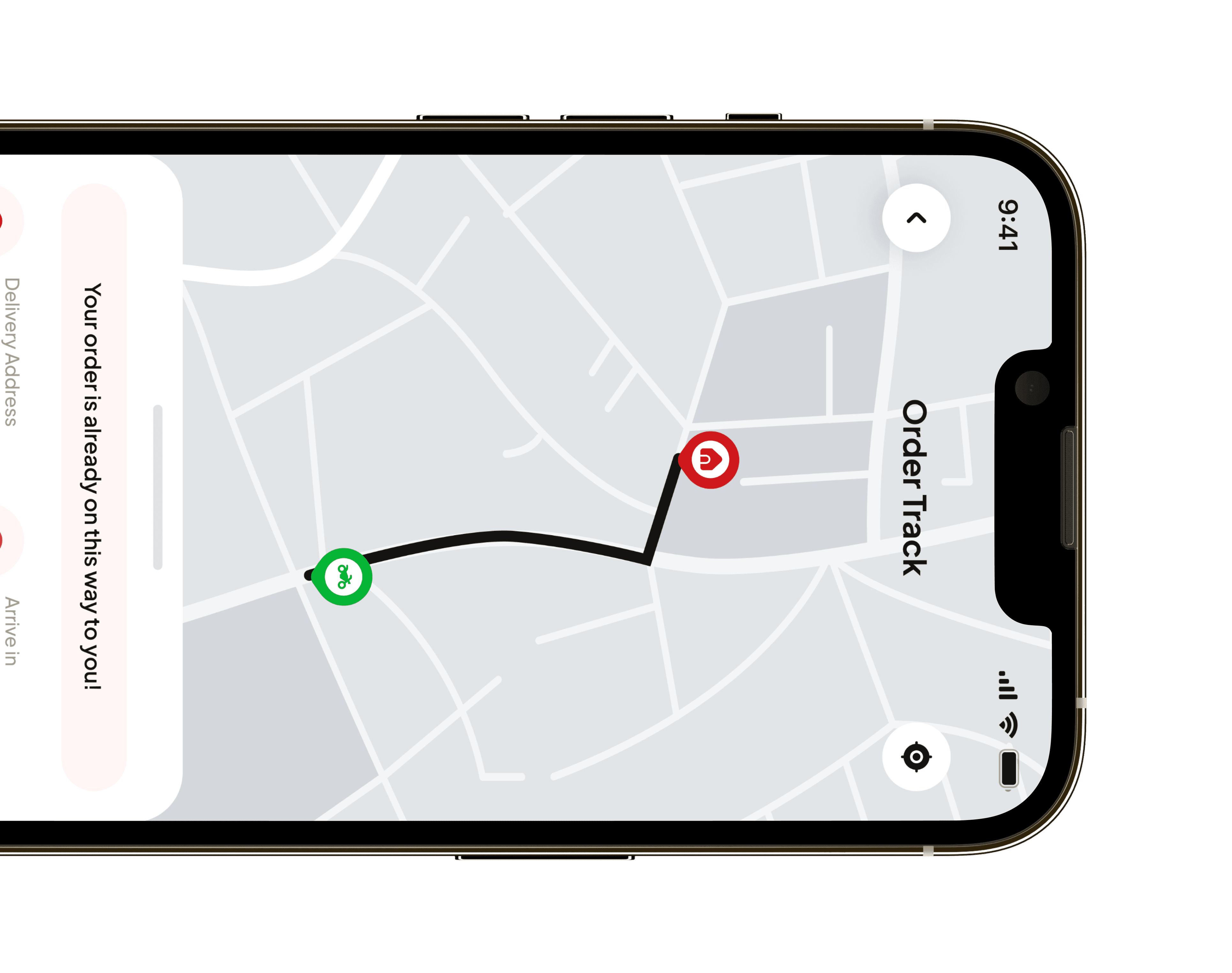
Wireframing & Prototyping: Designing the core flow to optimize order placement and tracking
Usability Testing: Ensuring that the new flow was intuitive and easy to navigate
Visual Design & Branding: Creating a cohesive, modern look that reflects the brand's identity
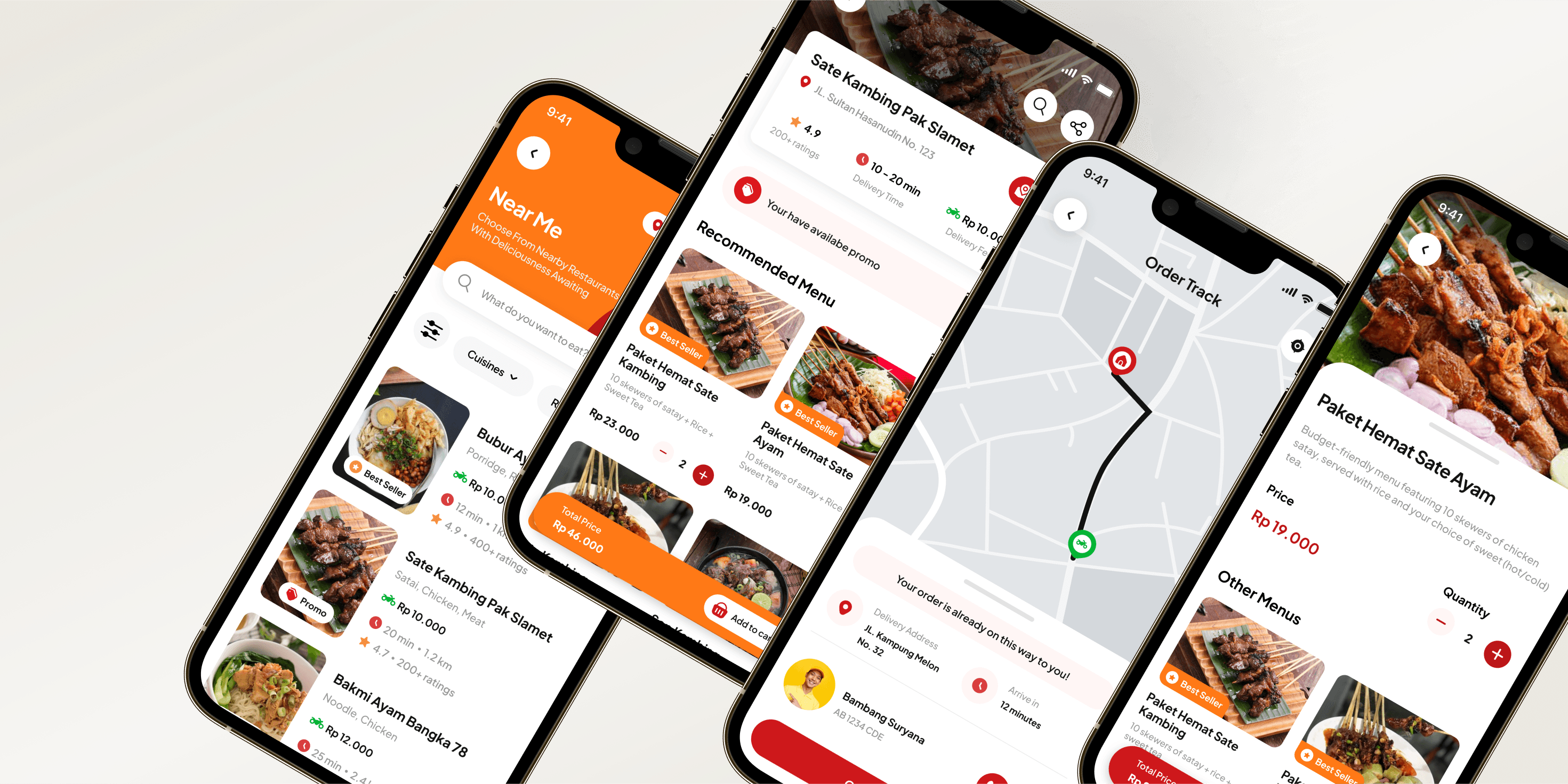
Design
Designing a simple and manageable
experience
The design focused on clean, minimal visuals with vibrant accent colors to highlight CTAs. The simple layout and intuitive navigation created a more pleasant and faster user experience.
Branding Colors: Bold and bright colors to reflect the energy of food and lifestyle
Typography: Clean and modern fonts that enhanced readability
Icons & Illustrations: Simple, recognizable icons for easy navigation


Results
Impact
20% increase in user retention within the first month after launch
30% reduction in abandoned orders due to the improved order flow
User satisfaction improved by 40%, as reported by follow-up surveys
Faster order completion times, with clearer tracking information